Elaf
Building a distinctive asset portfolio for a contractor competing in a parity category — where buyers recognise capability long before they compare quotes.
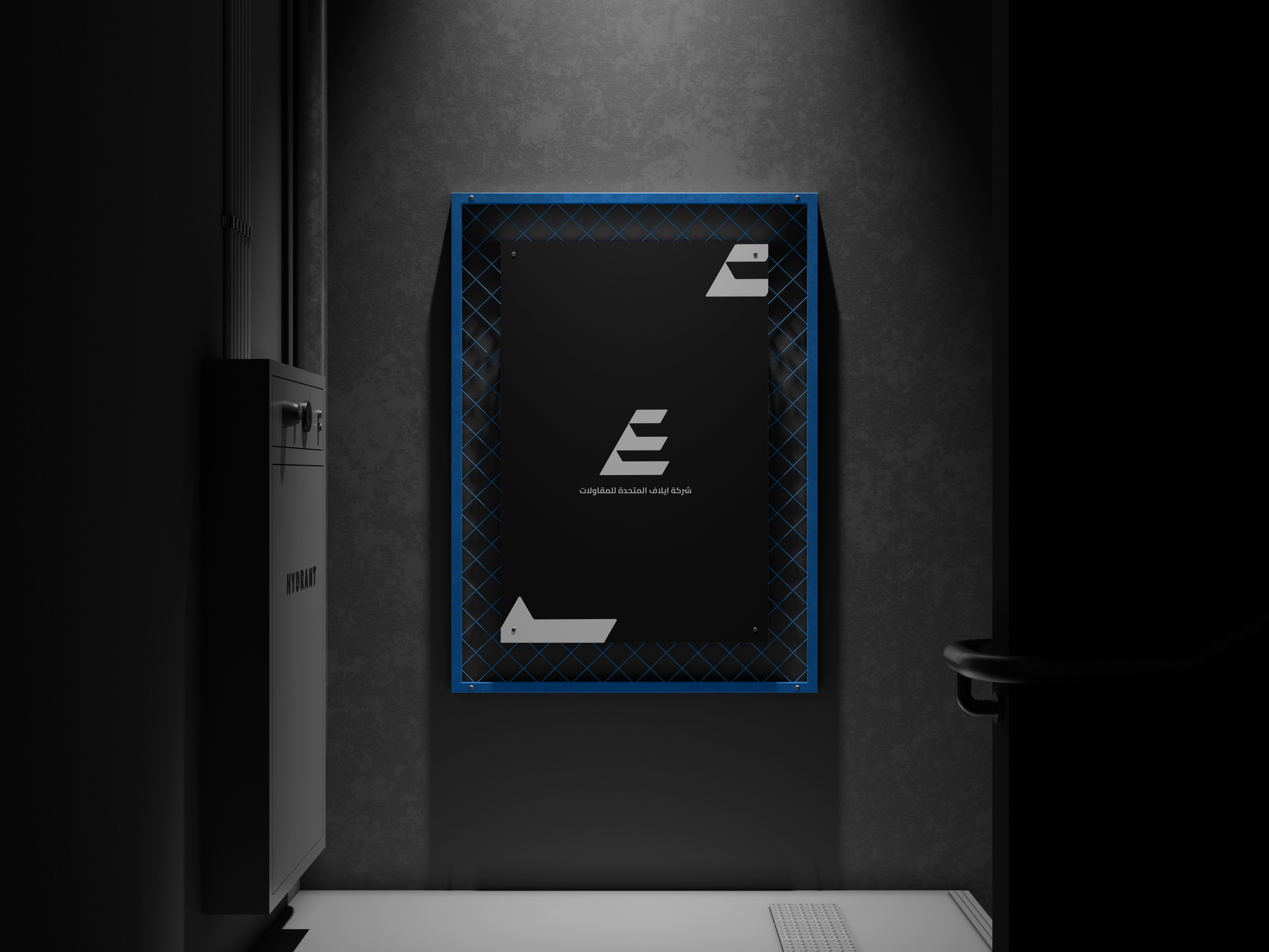
A category with no distinctive assets.
Our category audit found near-total visual parity: competitors sharing the same stock blues, generic marks, and interchangeable naming conventions. In a market where nothing is distinctive, no one is memorable — and procurement defaults to price.
Elaf's commercial problem was low brand salience. They were shortlisted on relationships, not recognition, which capped their ability to win work outside an existing network.
Our strategic objective was therefore not a logo, but a distinctive asset portfolio: a small set of ownable, repeatable cues deployed with total consistency, so the brand becomes recognisable at every stage of a long B2B buying cycle.
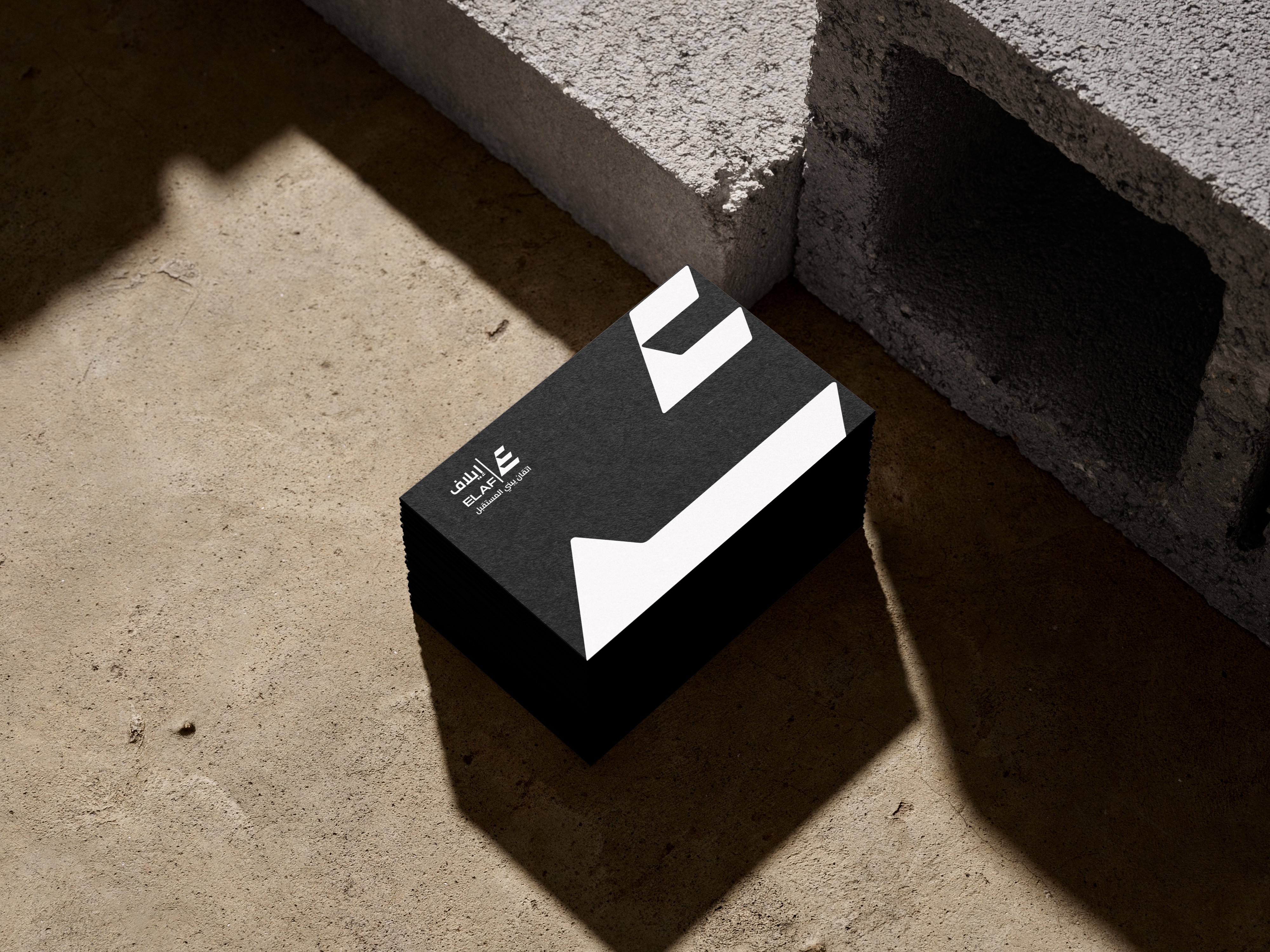
Engineered for recall, not decoration.
The monogram is built as a distinctive brand asset — a cue that must score high on both fame and uniqueness to be worth owning. It is deliberately geometric and reductive so it survives the two conditions that destroy most marks: small scale and fast exposure.
Because the construction is modular, the asset can be deployed at any scale without redrawing — and can be cropped to fragment level while remaining attributable. That fragment-level recognition is what compounds brand equity across repeated exposures.
One brand, two scripts, equal weight.
In bilingual markets, inconsistent localisation actively erodes recognition: if Arabic and English behave like two different brands, each exposure builds half the memory. We resolved this with a locked bilingual lockup — a single fixed asset, weight-matched across scripts.
Locking the relationship removes downstream execution drift, the most common source of brand inconsistency once assets leave the studio and enter suppliers' hands.

Consistency where it converts.
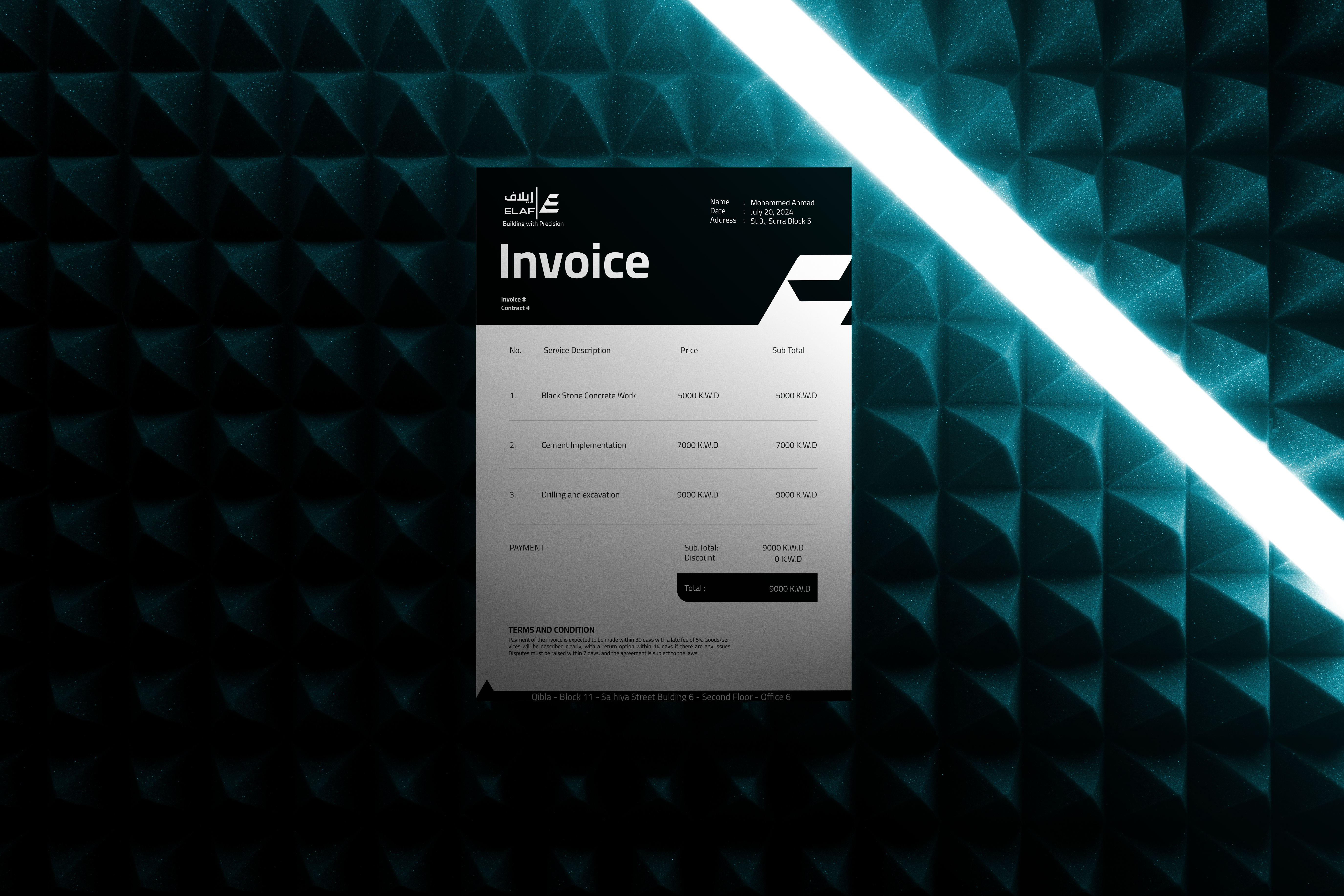
In contracting, commercial documents are high-attention touchpoints — read more closely than any advertisement. Templating the invoice and quotation extends the identity into the moments of highest scrutiny and reinforces perceived operational rigour.
A restricted palette is a defensible one.
The strategy, defined.
Distinctive brand asset
Any non-verbal cue — colour, shape, monogram, pattern — that buyers reliably attribute to one brand and no other. Assets are evaluated on two axes: fame (how many recognise it) and uniqueness (how few misattribute it to a competitor).
Brand salience
The propensity of a brand to be noticed and come to mind in a buying situation. Salience is a function of memory structures, not of how much a buyer likes you — which is why recognition, not persuasion, is the primary objective in low-interest categories.
Category parity
The state in which competing brands look and sound effectively identical, so buyers cannot encode a difference. Parity pushes decisions toward price. Breaking it is a design problem with a commercial payoff: pricing power.
Touchpoint consistency
Applying the same assets, identically, at every point of contact — including unglamorous ones like invoices and site signage. Consistency is what converts scattered exposures into a single, compounding memory rather than several competing ones.